Photography Composition
"Fundamental for Great Shots"Original Article by Helen Harris
"Article first featured in Olympus User Magazine"
UNDERSTANDING THE BASICS of photography composition can revolutionise your shots. Do you sometimes feel that your photos lack that indefinable ‘wow’ factor and would benefit from a bit more life and impact?
It’s a truism of photography that, however good your camera is, your shots will stand or fall by how well they are composed – how the shot is taken, how the elements are arranged within the frame, what’s left in and what’s left out. This can have a huge influence on the way people respond to your photographs, as good photography composition affects viewers on the subconscious level.
In this feature, we’ll introduce some of the golden rules of photography composition and framing and illustrate how they can improve your work. We’ll also show how post-shoot cropping can transform an otherwise so-so photo, and talk about when to break the rules!

1Learn your lines
Our first golden rule is to think about photography composition as you take the photo; as you line up the image in the viewfinder or LCD screen. Get this right and you won’t have to use image-editing software so much, and you’ll be making full use of your camera’s resolution.
Notice the ‘lines’ in the shot you’re about to take – the restful horizontal lines of fields or a seascape, or the thrusting vertical lines of a cathedral. Think how these lines can draw the viewer in, so get into the habit of structuring your photo around these lines – in the image above, note how the jutting shape of the roof works with the sinuous lines of the estuary to give a real sense of depth that a conventional full-on shot of the house simply wouldn’t achieve.
If your photos regularly seem flat, make use of vertical, horizontal or diagonal lines to draw the eye in and create depth.

2Think about thirds
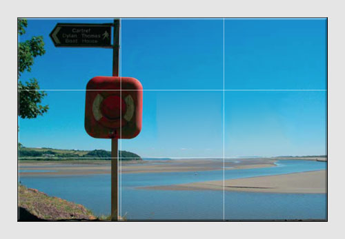
An old chestnut of photography composition involves placing the subject of the photograph off centre, towards the left or right edge. Doing so causes the viewer to subconsciously move around the image, noticing the different elements, and getting a better sense of how the subject relates to its environment. It’s just more visually pleasing than plonking the subject dead centre.
The rule of thirds can be applied to portraits or landscape – simply visualize the image in the viewfinder as being divided into nine sections via two vertical lines and two horizontal lines. Position the subject/focal point where the lines intersect for maximum impact.
 3The focal point
Decide on the central point of interest and make sure the background and foreground don’t overpower it. With the subject in your viewfinder/LCD, move around until you’re sure that it’s got enough space to ‘breathe’ in your shot.
This image fails because there’s too much clutter in the foreground – what is the focal point, the plants or the mountain? As with many other things, in photography often less is more.
4Learn from the masters
Studying photography composition needn’t be a dry, academic discipline – just look at the work of professional photographers in books, magazines and web sites, and see how they apply (and sometimes break) the rules!
And don’t forget the ‘Old Masters’ – inspiration can be found in the layout and structure of paintings and drawings. Just because they are made of paint and not pixels doesn’t mean that their composition won’t work in photographs.

5In the frame
Think about framing portraits against an architectural frame – a doorway or deep window, perhaps – or a natural frame, as provided by a bower of trees, or a garden arch. It’s visually pleasing to see the subject contextualized in this way, in harmony with the environment.
Notice how often wedding photographers frame the happy couple within the church door. Shooting a child within a window frame can also transform a predictable portrait shot.
 6Crop with care
One of the joys of digital photography is the ease with which a poorly composed shot can be improved by cropping with software – a shot can be cropped so it meets the rule of thirds, for instance, or distracting objects can be cropped out of the foreground or background to fix attention of the focal point.
By using software, such as the Camedia Master or Olympus Master, crop in close to big objects so they dominate the frame in a visually dramatic way. Be very careful not to cut people off at the head or feet as it can spoil an otherwise good portrait. Save the original image under a different name before you start cropping. In the image below, too much of the foreground has been cropped, leading to a dull, flat shot.

7A matter of perspective
When shooting buildings or large objects, move around to get the best arrangement in the frame – big things tend to look better if they dominate the shot, but don’t be afraid to get higher or lower than objects to get a more interesting perspective.
This works for people shots too – here, just crouching down has made for a more interesting and candid photograph. Always try and change the perspective when shooting commonly photographed objects or things, be they stately homes, monuments or babies.
When to break the rules
Hopefully you understand a bit more about the importance of framing, leading lines, the rule of thirds and focal points. But don’t get carried away – if every shot you take slavishly follows the rule of thirds, for instance, your work will soon look predictable and formulaic.
Putting the subjects in the middle of the shot can work well for close-ups and more reportage/candid photography, and you should never, ever miss a great photo opportunity because you haven’t ‘lined it up right’. If an image is well balanced, with the subject sympathetically arranged in relation to its environment, it will work regardless.
© Olympus UK
Click here for more Tutorial Articles by OM Systems
(formerly Olympus Cameras).
Return from Photography Composition to the Photography Tutor page.


 3The focal point

 6Crop with care


New! Comments
Have your say about what you just read! Leave me a comment in the box below.